What’s new
A more helpful start for new collections
An empty profile now offers a simple path to add your first razor, finish your profile, or browse other collections for inspiration.
See comparison
Before 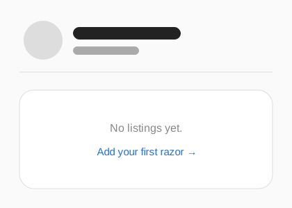
After 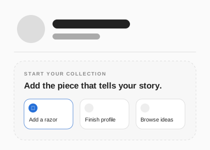
Explore every photo from the collection
Collection photos now keep their natural shape whenever practical. Swipe through every photo without leaving the collection, or pinch for a closer look on your phone.
Browse the collectionMore about this update
Only unusually tall photos receive a gentle height limit, so ordinary compositions are no longer forced into the same crop. The photo count follows along as you swipe, and pinching gives you a quick close-up without opening a separate full-screen view.
Before 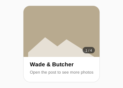
After 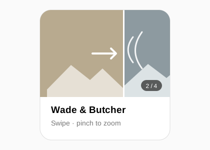
Faster, smoother photo conversations
Photos in messages now appear more quickly, and new messages and reactions arrive with less waiting or jumping.
Open messagesSee comparison
Before 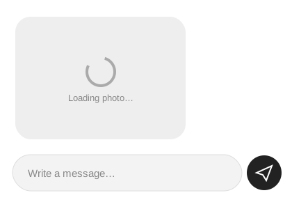
After 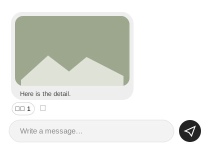
Better profiles and useful links
Profiles read more naturally on phones, and every razor can now include a related website for its maker, restorer, or another helpful reference.
More about this update
Profile descriptions and actions now use the full phone width below the collector’s name and photo. Tapping a tag on a razor takes you to that search at the top of the collection, and sharing a razor no longer adds its full description to the message.
Before 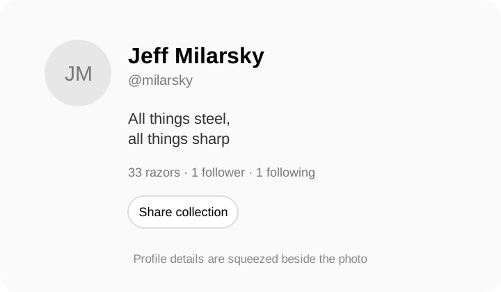
After 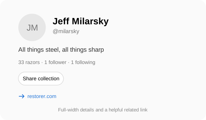
Roomier, easier-to-read menus
Account and collection menus now give every action more breathing room, with aligned icons and labels that stay on one line.
See comparison
Before 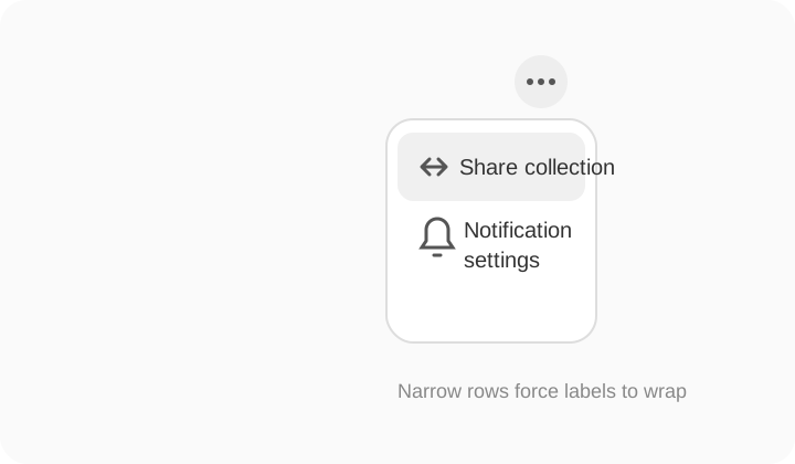
After 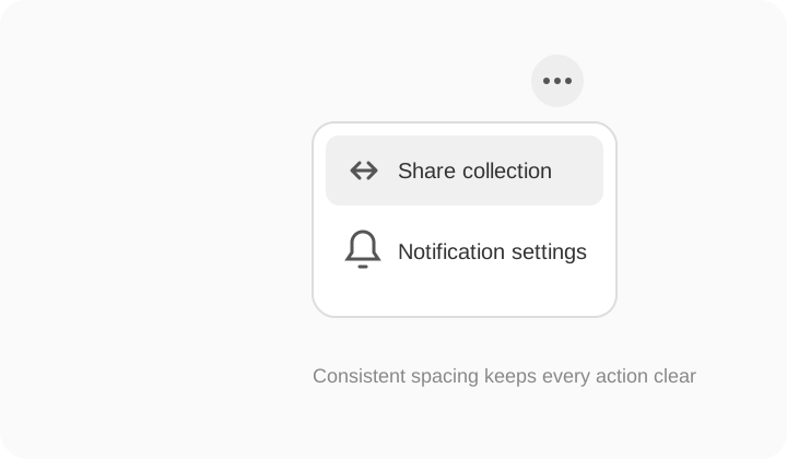
Easier ways to move around
The account menu now puts “Add a razor” first, and profiles, listing forms, and conversations make the way back easier to understand.
More about this update
When you open a collector from a comment, message, or liked razor, the return link remembers that context. Adding and editing a razor keeps a clear return action at the top of the form, while the conversation arrow is labeled “Messages” on larger screens.
Before 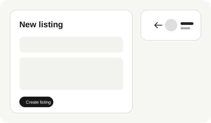
After 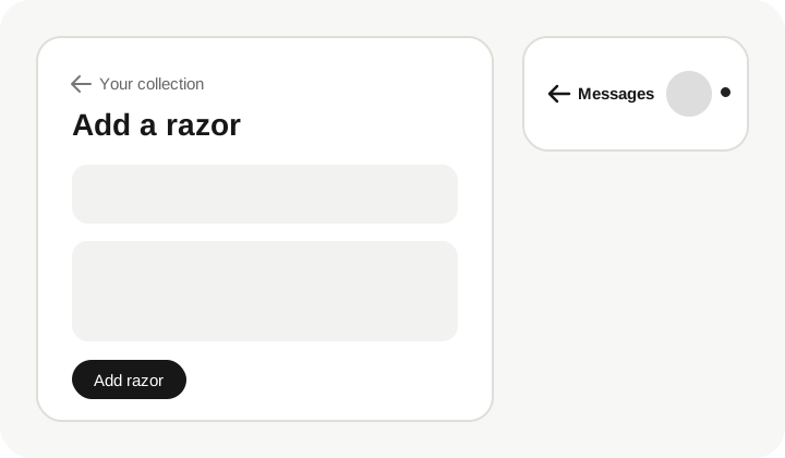
Search filters that are easier to see
Search now stays quietly behind a magnifying glass until you need it. Choosing a tag opens search automatically and keeps the active filter visible with a clear remove button.
More about this update
The browsing control now glides smoothly between New, Popular, Following, and For Sale. Closing search clears its text and tag choices, so the full collection is shown again.
Before 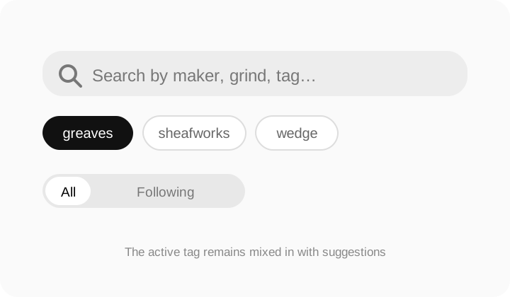
After 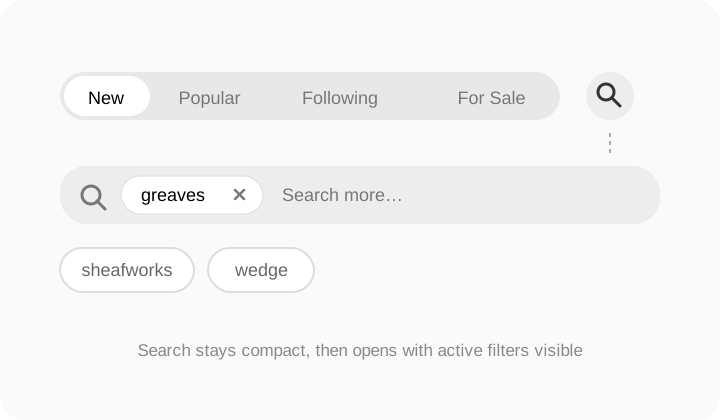
Clearer controls where you need them
Photo editing, listing actions, profile tools, and mobile filters now give everyday choices priority while keeping occasional options close by.
More about this update
Photo controls no longer overlap each other: each saved photo has one clear toolbar for changing its position or removing it, and newly selected photos include rotation before upload. Listing and profile pages keep common actions visible and place occasional settings in a small more menu. On phones, browsing filters use two balanced rows rather than squeezing every choice onto one line.
Before 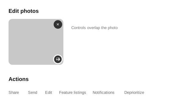
After 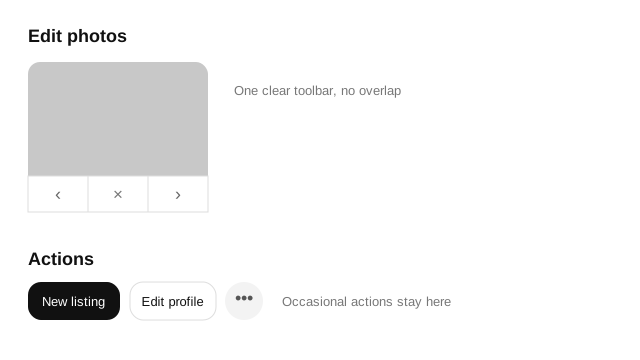
A cleaner conversation under each post
Comments now use a focused, compact layout with clearer replies and a simpler place to write and post without breaking the flow of the discussion.
More about this update
The conversation stays comfortably readable instead of stretching across a wide desktop screen. Usernames and comment text are easier to scan together, replies have a quiet visual thread, and the comment box keeps emoji, writing, and posting in one control. The same layout retains generous tap targets on phones.
Before 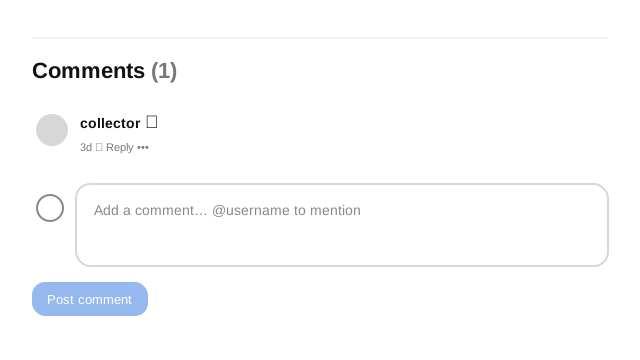
After 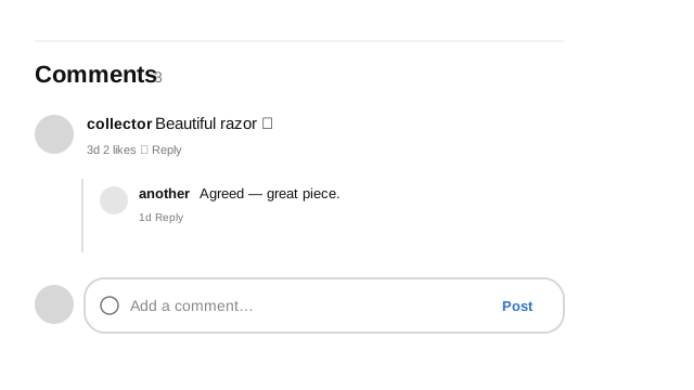
A clearer following button
Profiles you follow now show a green check, and the button changes to “Unfollow” before you select it again on devices with a pointer.
See comparison
Before 
After 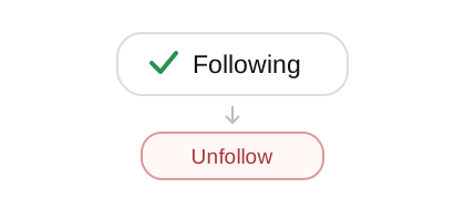
Photos prepared before posting
Listing photos are now checked, correctly oriented, and compressed when helpful, with a warning when a photo looks dark, blurry, or likely to crop awkwardly.
More about this update
You can rotate a selected photo without leaving the listing form. Large photos are made easier to upload while the full-size image remains clear. Selected photos are also restored with the rest of an unfinished listing after an accidental refresh.
Before 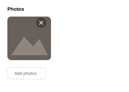
After 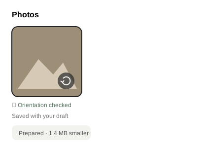
A quieter place for first messages
Messages from someone you have not spoken with wait in Requests, where you can accept them without crowding your regular inbox.
Open messagesMore about this update
Opening a request does not send a read receipt until you accept or reply. Conversation options now include mute, block, and report, tucked into a small menu so they stay available without adding noise. Blocking prevents new messages while leaving the existing conversation visible for reference.
Before 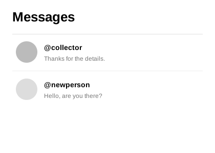
After 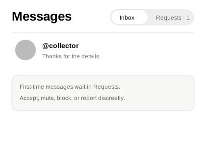
Update sale status in fewer steps
Owners can mark a listing not for sale, for sale, pending, or sold directly from its card without opening the full editing form.
Better previews when sharing
Shared listings and profiles now carry a useful title, description, and collection photo in supported messaging and social apps.
Photos and clearer unread messages
Send a photo in a conversation with an optional note, spot where unread messages begin, and change a reaction after choosing it.
Open messagesMore about this update
Photos stay inside the conversation so you can share a close-up without creating a listing first. A “New messages” line marks the exact point where unread replies begin, even in a longer conversation. Reactions can now be changed simply by choosing a different emoji.
Before 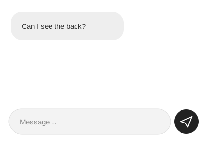
After 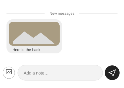
Useful details at a glance
Listings can now show condition, originality, and availability clearly, with more items from the same collector close by.
Browse listingsMore about this update
These details are optional, but when provided they are easier to understand than searching through tags or a long description. Availability keeps for-sale browsing accurate while also allowing an item to be marked sold. A separate section shows more from the collector without repeating the related listings already on the page.
Before 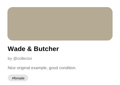
After 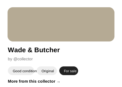
Put favorite pieces first
Choose up to three listings to feature at the top of your profile and arrange them in the order you prefer.
More about this update
Featured listings give visitors a quick introduction to the pieces you most want them to see. You can change the selection or order from your own profile whenever you like. The rest of your collection remains directly below, so nothing becomes harder to find.
Before 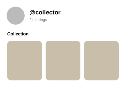
After 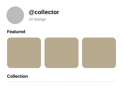
Choose the activity you hear about
Control alerts for messages, mentions, comments, replies, and new followers from your profile settings.
A tidier mobile header
The notification bell and account photo now use matching round buttons and balanced sizing, making the top of the page feel calmer and easier to scan.
More room on listing pages
On phones, the return link now sits in the top header instead of taking up a separate row above each listing. It still returns you to the collection, profile, or saved list you came from.